Using TARDIS Widgets
This page describes what each TARDIS Widget has to offer and how you can make the best use of it. If you’re looking for the code to generate widgets, head over to Generating Custom Abundance Widget section or Generating Data Exploration Widgets section to see the notebook in action.
Currently, TARDIS supports the following widgets:
Custom Abundance Widget
This widget (or GUI) allows you to develop custom model compositions graphically and output the model to a new file.
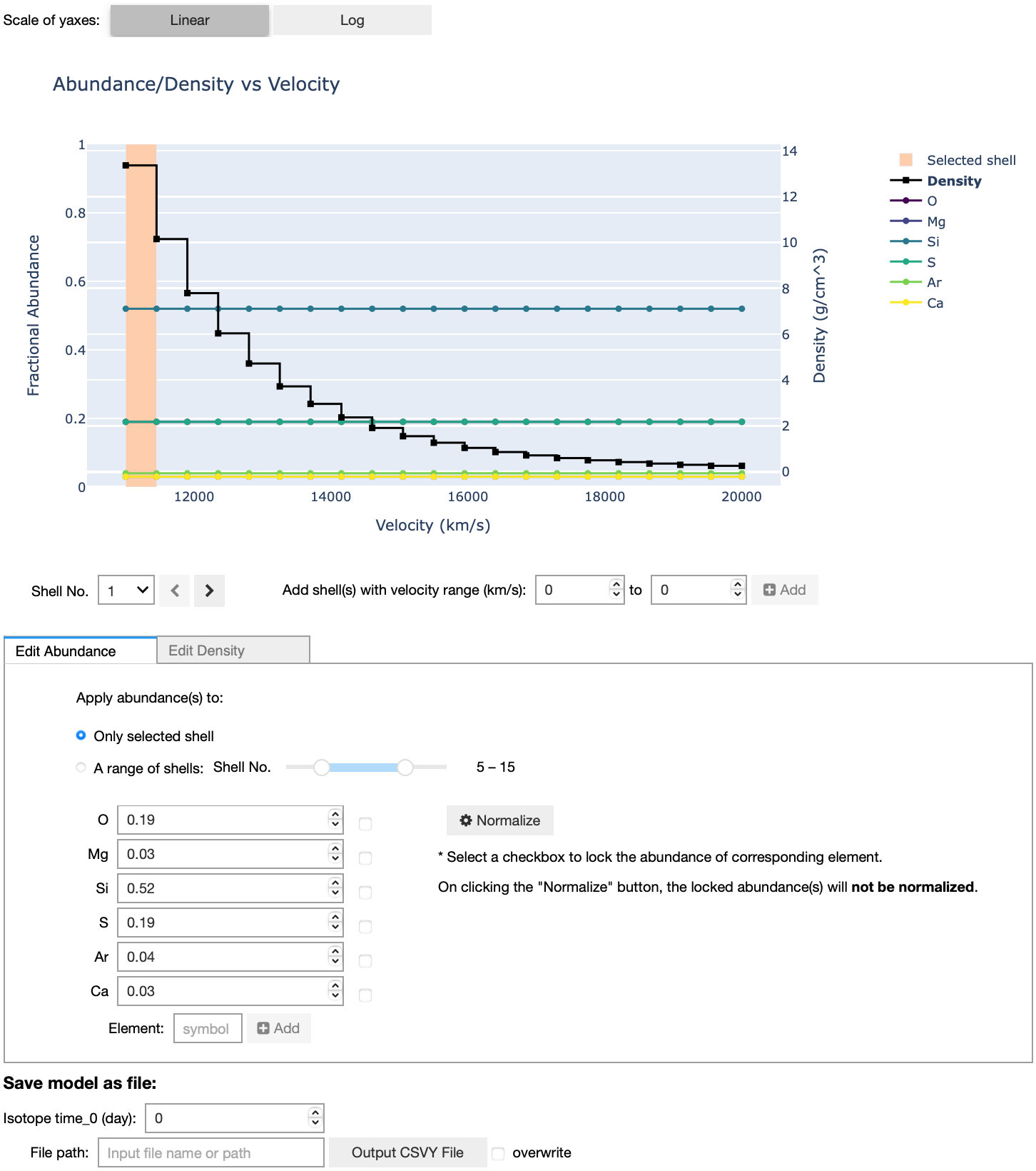
The GUI consists of three parts:
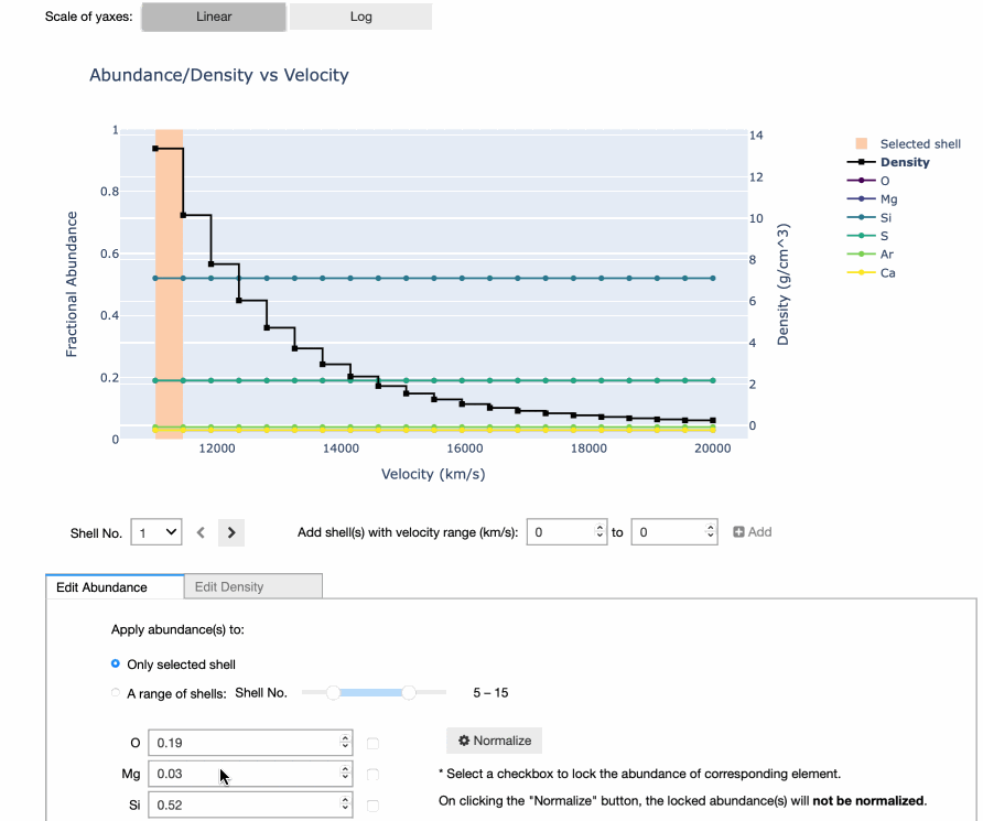
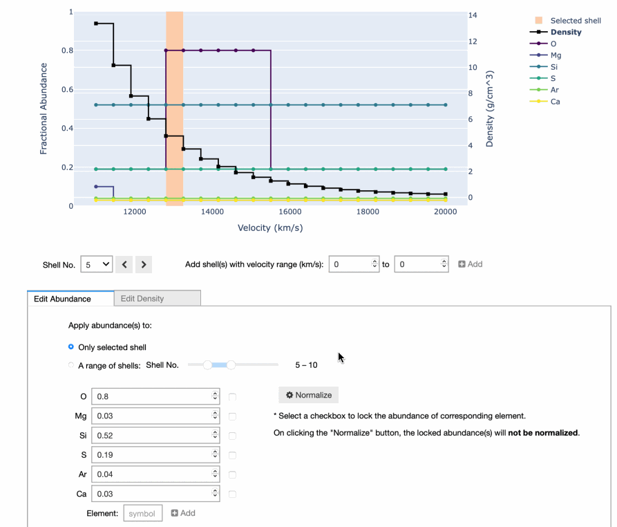
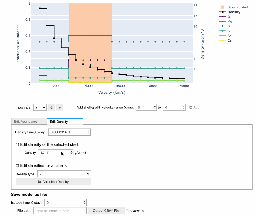
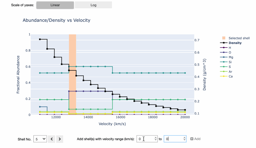
1. Visualization plot - An interactive step graph that shows abundances and densities as a function of velocity.
2. Data editor - An interface to edit abundances, densities and velocity shells.
3. File output - An output module to save the model compositions as a CSVY file.
Interacting with the GUI
You can interact with this GUI in the following ways:
Edit Abundances
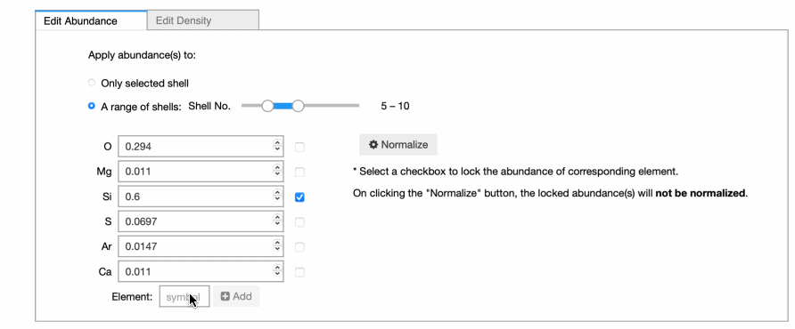
There are two radio buttons which allow you to edit either single shell or multiple shells. The new input will be applied to selected shell(s) immediately and the plot is updated at the same time. If you want to edit multiple shells at a time, remember to choose the second radio button and set the range of shell number using int slider. The selected shell(s) is highlighted in the plot.
Normalize Abundances
Click Normalize button to normalize the abundances on selected shell(s) to
1. If you wish to keep the abundance of a certain element unchanged during the
normalization, you can select the checkbox near that element to lock it.
The normalization will be applied to other elements and the sum of the
abundances still remains at 1.
Edit Densities
In Edit Density tab, you also can edit either single shell or the whole
density profile. To calculate a new profile, you need to choose the density
type and input required parameters.
Add New Element
At the bottom of the editor, the symbol input box allows you to add new element or isotope to the model. It automatically recognizes whether the symbol exists or whether the element is already in the model.
Add New Shell
Another important functionality is to add new shell to the model. You need to specify the velocity range of the new shell and abundances at that new shell will be set to 0. Note that the existing shell(s) will be resized smartly if the new shell overlaps with it.
Shell Info Widget
This widget allows you to explore the chemical abundances in different shells of the model Supernova ejecta.
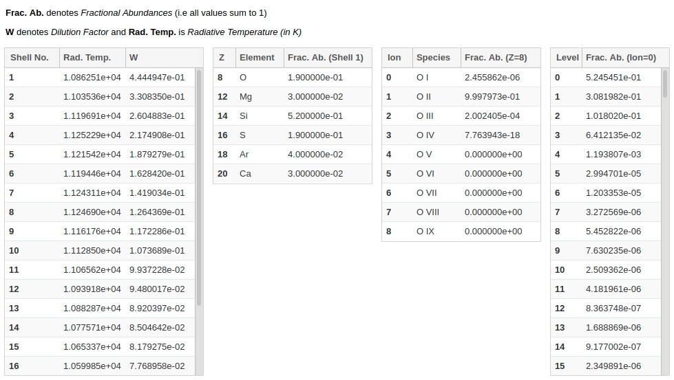
It consists of four interlinked tables - clicking on any row in a table, populates data in the table(s) to the right of it. Each table has the following information:
1. Shells Data - Radiative temperature and Dilution Factor (W) of each shell (computational partitions) of the model Supernova ejecta. Shell numbers are given in ascending order, from the innermost shell to the outermost.
2. Element Abundances - Fractional mass abundance of each element present in the selected shell.
3. Ion Abundances - Fractional mass abundance of each ion (species) of the selected element present in the selected shell.
4. Level Abundances - Fractional mass abundance of each level of the selected ion and element in the selected shell.
Line Info Widget
This widget lets you explore the atomic lines responsible for producing features in the simulated spectrum.
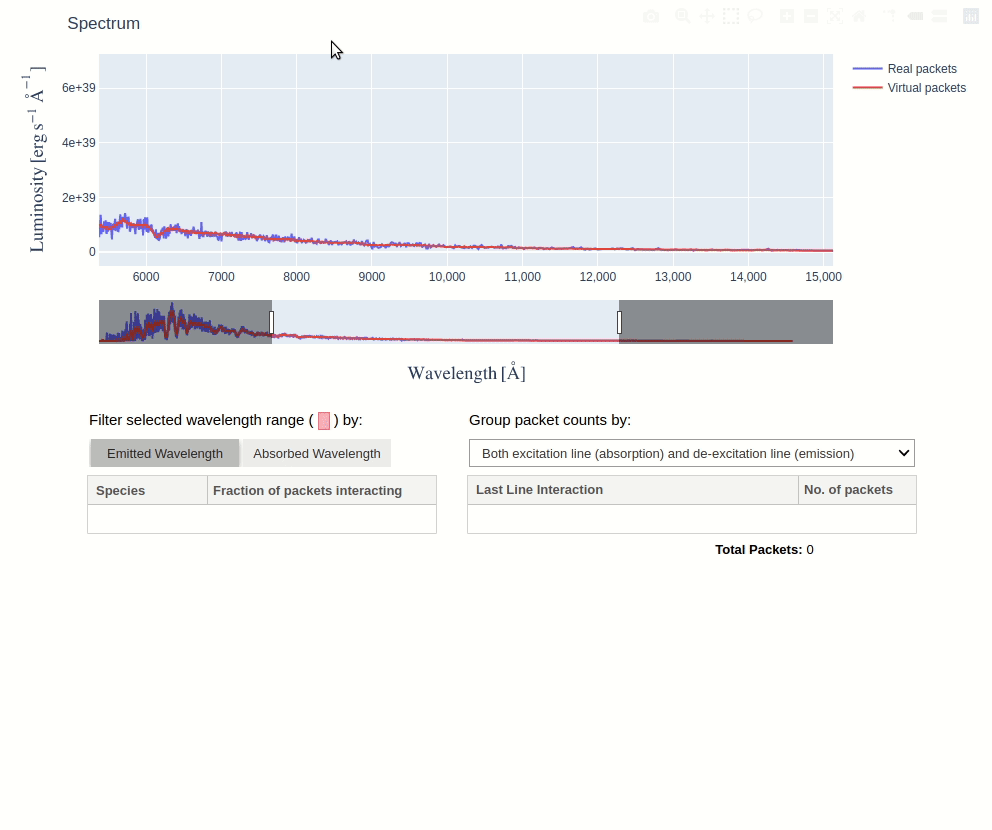
By selecting a wavelength range on the spectrum plot, you can see the species that produced the features within that range. This is determined by counting the number of escaping packets that experienced their last interaction with each species. Packets can be filtered by the wavelength at which they were absorbed or emitted, using the toggle buttons.
You can then click on a species to see the packets count for each last line interaction it experienced. Using the dropdown menu, these counts can be grouped by excitation lines, de-excitation lines, or both.
Interacting with Spectrum
The spectrum in the Line Info Widget is an interactive figure made using plotly, there are several things you can do with it:
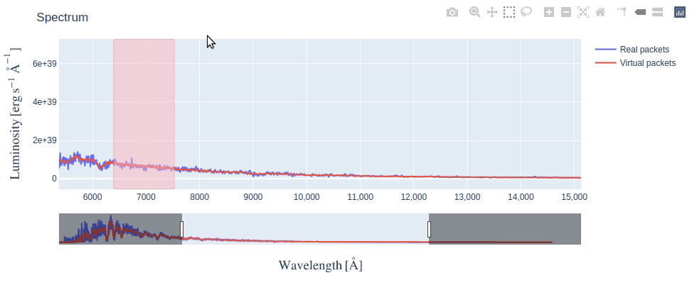
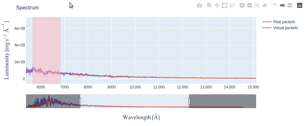
Making Selection
The box selection is enabled by default, so you just need to click and drag on the figure and a pink colored selection box will appear. By making a selection across the wavelength range you’re interested in, tables update to show line information of only packets from that range.
After making a selection, if you need to resize the selection box (say, make it narrower), simply redraw a new selection box over the older one.
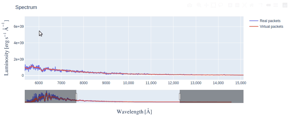
Using Rangesilder
The rangeslider is a long bar below the figure that allows you to zoom in on a particular wavelength range in the long spectrum.
Either you can slide the zoomed range by clicking and dragging it or you can resize it by dragging the handles (vertical bars) at its edges.
Using other options in Modebar
If you take your mouse to the top right corner of the figure, you will see a Modebar with multiple options. The default option when Line Info Widget first displays is Box Select - the dotted square icon. You can click on other options like Zoom (magnifying glass icon), to do a rectangular zoom which may be helpful to focus on a feature in the spectrum. You can always revert back to the initial state of the figure by clicking on Reset Axes option.
There are also several other options in the modebar which we have not explained (because they are not very relevant) but you’re free to explore them as long as you remember to click back on the Box Select option for making selections on spectrum.
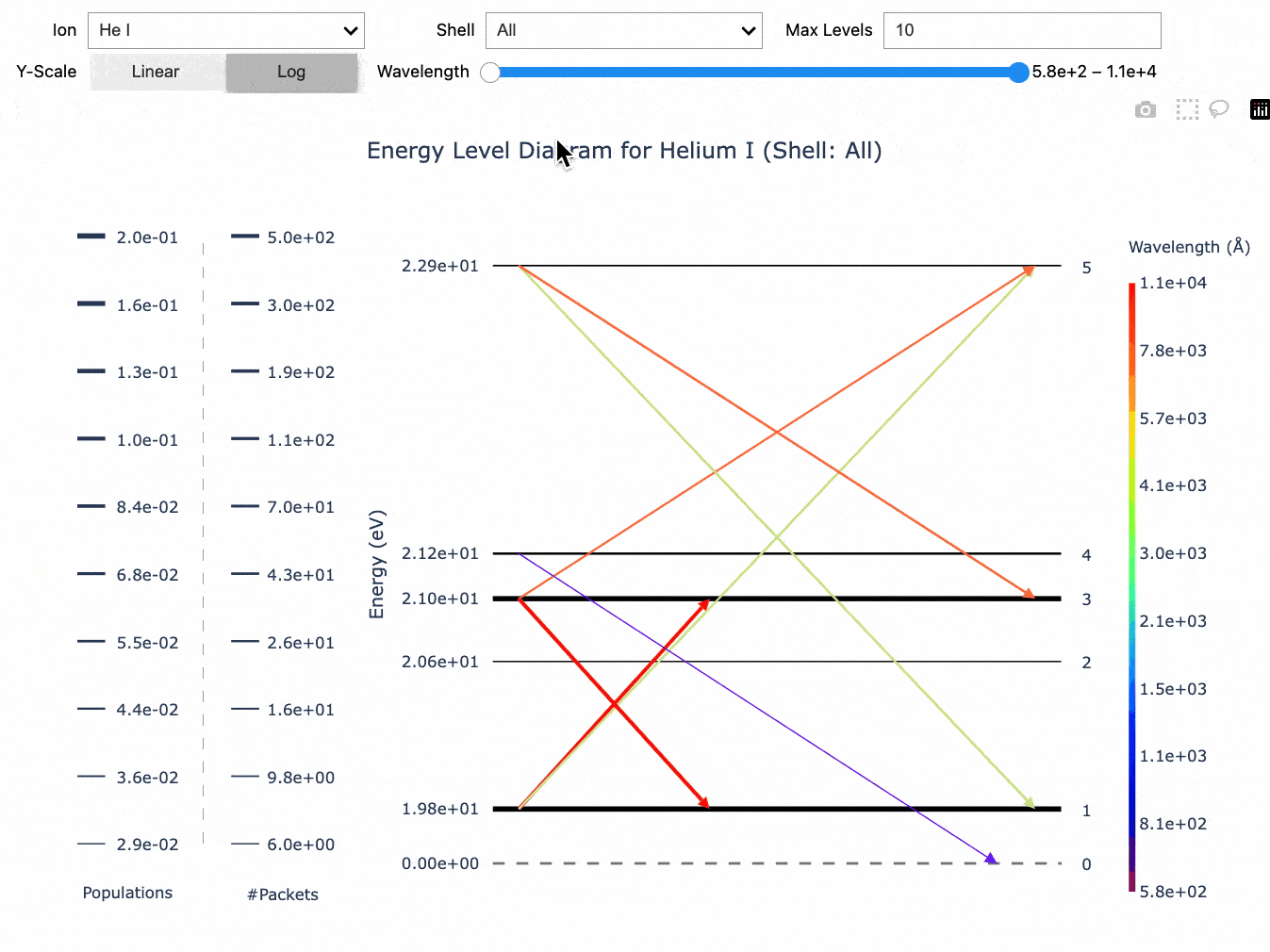
Energy Level Diagram
This widget lets you visualize the last line interactions
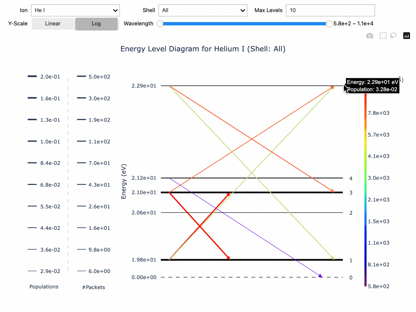
By selecting an ion on the widget, you can see its energy level diagram, which also shows information about the last line interactions experienced by packets in the simulation.
The y-axis of the plot represents energy while the horizontal lines show discrete energy levels. The thickness of each line represents the level population, with thicker lines representing a greater population than the thin lines.
Arrows represent the line interactions experienced by packets. Upwards arrows show excitation from lower energy levels to higher levels and downward arrows show de-excitation from higher energy levels to lower levels. The thickness of each arrow represents the number of packets that underwent that interaction, with thicker lines representing more packets than the thin lines. The wavelength of the transition is given by the color.
You can select the range on which to filter the wavelength using the slider. You can also select the model shell by which to filter the last line interactions and the level populations. If no shell is selected, then all the last line interactions are plotted and the level populations are averaged across all shells in the simulation. You can also set the maximum number of levels to show on the plot.
Lastly, you can also set the scale of the y-axis: Linear or Log.