You can interact with this notebook online: Launch notebook
How to Generate Data Exploration Widgets
A demonstration of how to generate TARDIS widgets that allows you to explore simulation data within Jupyter Notebook with ease!
This notebook is a quickstart how-to guide, but more details on each widget (and its features) is given in the Using TARDIS Widgets section of the documentation.
First create and run a simulation that we can use to generate widgets (more details about running simulation in Quickstart section):
[1]:
from tardis import run_tardis
from tardis.io.atom_data import download_atom_data
from tardis.io.configuration.config_reader import Configuration
# We download the atomic data needed to run the simulation
download_atom_data('kurucz_cd23_chianti_H_He_latest')
config = Configuration.from_yaml("tardis_example.yml")
config.montecarlo.tracking.track_rpacket = True
sim = run_tardis(config, virtual_packet_logging=True)
Atomic Data kurucz_cd23_chianti_H_He_latest already exists in /home/runner/Downloads/tardis-data/kurucz_cd23_chianti_H_He_latest.h5. Will not download - override with force_download=True.
Auto-detected Sphinx build environment
Auto-detected Sphinx build environment
Initializing tabulator and plotly panel extensions for widgets to work
Embedding the final state for Jupyter environments
Now, import functions & class to create widgets from visualization subpackage:
[2]:
from tardis.visualization import (
shell_info_from_simulation,
shell_info_from_hdf,
LineInfoWidget,
GrotrianWidget,
)
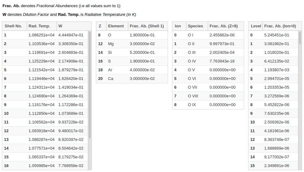
Shell Info Widget
This widget allows you to explore chemical abundances of each shell - all the way from elements to ions to levels - by just clicking on the rows you want to explore!
There are two ways in which you can generate the widget:
Using a Simulation object
We will use the simulation object we created in the beginning, sim to generate shell info widget. Then simply display it to start using.
Note for Documentation Viewers
The interactive widget below will not function in the published documentation. To use this widget, please run this notebook locally in a Jupyter environment with TARDIS installed.
[3]:
shell_info_widget = shell_info_from_simulation(sim)
shell_info_widget.display()
[3]:
You can interact with the widget produced in output above (which won’t be visible if you’re viewing this notebook in our docs as an html page) like this:
Use the button at the top of this page to run the notebook in interactively to use the widgets!
Using a saved simulation (HDF file)
Alternatively, if you have a TARDIS simulation model saved on your disk as an HDF file, you can also use it to generate the shell info widget.
[4]:
# shell_info_widget = shell_info_from_hdf('demo.h5')
# shell_info_widget.display()
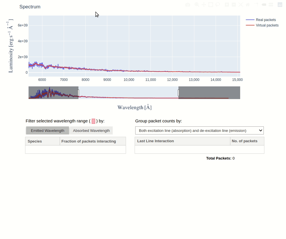
Line Info Widget
This widget lets you explore the atomic lines responsible for producing features in the simulated spectrum.
You can select any wavelength range in the spectrum interactively to display a table giving the fraction of packets that experienced their last interaction with each species. Using toggle buttons, you can specify whether to filter the selected range by the emitted or absorbed wavelengths of packets. Clicking on a row in the species table, shows packet counts for each last line interaction of the selected species, which can be grouped in several ways.
Note for Documentation Viewers
The interactive widget below will not function in the published documentation. To use this widget, please run this notebook locally in a Jupyter environment with TARDIS installed.
To generate line info widget, we will again use the simulation object sim and then display the widget:
[5]:
line_info_widget = LineInfoWidget.from_simulation(sim)
line_info_widget.display()
[5]:
You can interact with this widget (which again won’t be visible if you’re viewing this notebook in our docs as an html page) like this:
Note
The virtual packet logging capability must be active in order to produce virtual packets’ spectrum in Line Info Widget. Thus, make sure to set virtual_packet_logging: True in your configuration file. It should be added under virtual property of spectrum property, as described in configuration schema.
Line Info Widget with SDEC Plot
The line info widget can also display a SDEC Plot. This can be enabled by passing show_sdec=True when creating the widget. Parameters to customize the SDEC plot can be passed in sdec_kwargs argument as a dictionary. It accepts the same parameters as SDECPlotter.generate_plot_mpl()
[6]:
plot = LineInfoWidget.from_simulation(sim, show_sdec=True, sdec_kwargs={"packets_mode": "real"})
plot.display()
[6]:
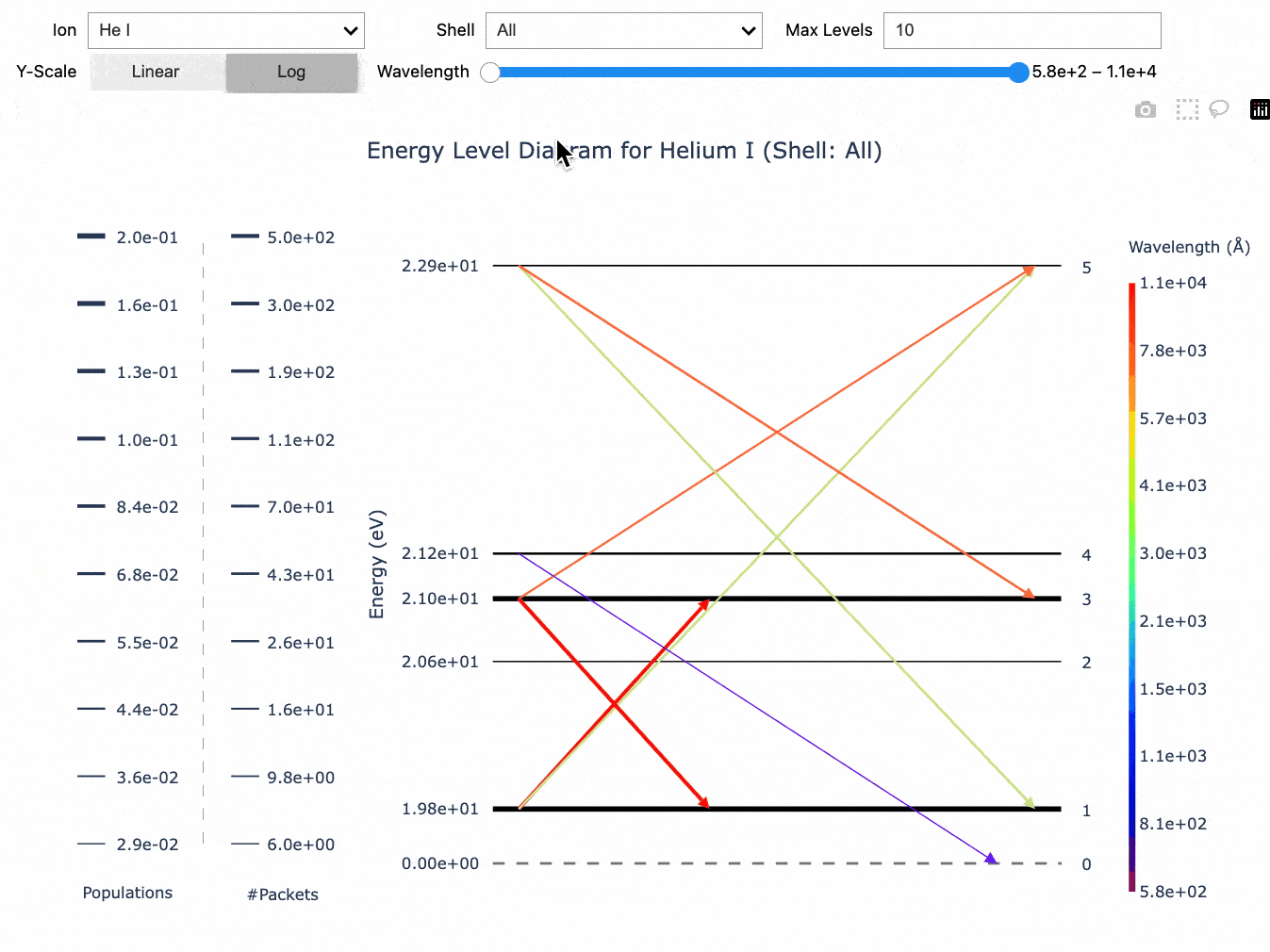
Energy Level Diagram
This widget lets you explore and visualize the various level populations and line interactions in a simulation in the form of an Energy Level Diagram.
You can select any ion present in the simulation and filter the transitions by wavelength or model shell to display an energy level diagram, where:
The horizontal lines represent the energy levels. The thickness of each line shows the relative population of that energy level, with thicker lines being more populated.
The arrows represent the line interactions between levels, with the arrow direction giving the direction of the transition. The thickness of each arrow also shows the number of packets that underwent the transition while the wavelength is given by the color.
In addition, you can also select between linear- and log-scaling for the y-axis (which represents the energy of each level) and the maximum number of levels to display, beginning from the lowest energy levels.
Note for Documentation Viewers
The interactive widget below will not function in the published documentation. To use this widget, please run this notebook locally in a Jupyter environment with TARDIS installed.
To generate the energy level diagram, we will again use the simulation object sim and then display the widget:
[7]:
energy_level_widget = GrotrianWidget.from_simulation(sim)
energy_level_widget.display()
[py.warnings ][WARNING] /home/runner/micromamba/envs/tardis/lib/python3.14/site-packages/pandas/core/arraylike.py:402: RuntimeWarning: divide by zero encountered in log
result = getattr(ufunc, method)(*inputs, **kwargs)
(_py_warnings.py:230)
[7]:
You can interact with this widget (which again won’t be visible if you’re viewing this notebook in our docs as an html page) like this: